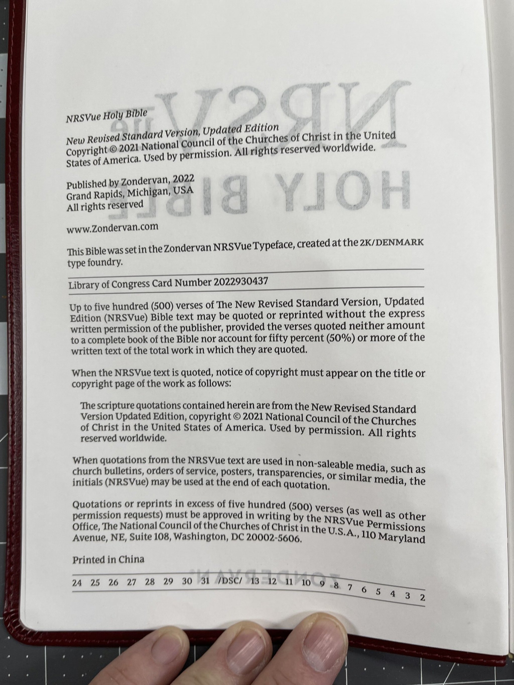
Comparison of the new Zondervan NRSVue paper
As many of you may already know, Zondervan has printed 2 versions of their new NRSV-UE Bibles in what is essentially a large print thin line layout. One is available with the Apocrypha/Deuterocanonical Books, and another without the Apocrypha.
The Apocrypha edition is available in goatskin, and leathersoft, using 36gsm European Bible paper, and is printed in China.
The non-Apocrypha edition is currently only available in multiple colors of leathersoft. Interestingly, the non-Apocrypha version also includes 36gsm paper, however, it is not stated to be European paper, and it’s not. You can see and feel a slight difference in the two papers. The non-Apocryphal editions are also printed in China.
We’ll try to compare the two different paper options used in these Bible in an attempt to show the two papers together, with the accompanying photos. Since the page layout and colors are the same page for page, it should be a good comparison. The only real difference I saw was the title page. One is two color, while the other is black and white.
Please be aware that the Apocrypha edition with the European paper will always be on the left, and the non-Apocrypha edition, with the non European paper, will always be on the right in the pictures.
In the gallery below, each photo is a picture of exactly the same page in each block. My brother and I compared the two versions. We attempted to pick examples of full text pages, poetic settings, and pages that had some red printed behind the page pictured. Again, each photo in the gallery will have the European paper on the left, and the non European paper on the right. As always the ghosting is much worse in photos.
As far as the papers themselves they are both very good. The European paper is a brighter white, while the non European paper is more off white. The European paper is a little smoother to the touch as well.
The odd thing is that in most of these pictures, the European paper seems less opaque than the non European paper. My brother and I both thought it was just the opposite to the eye. This may be a trick of the light, I cant say. Also the print seemed slightly darker to me, and the red deeper, in the European paper edition than in the non European edition. But only slightly.
To borrow a phrase from the OG reviewer, Randy Brown, both 36gsm papers are easy to grip and turn. A good experience using either.
I think what the pictures above do show, is that there is not a huge difference in the paper when comparing them. The European paper is slightly better. However, I believe you will be pleased with either paper.


